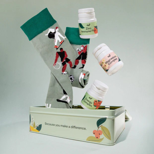
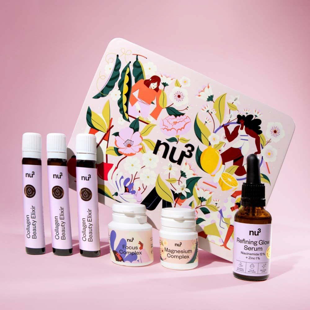
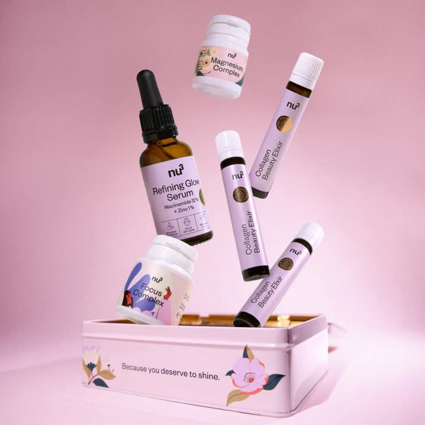
Nu3 Box
Packaging Design
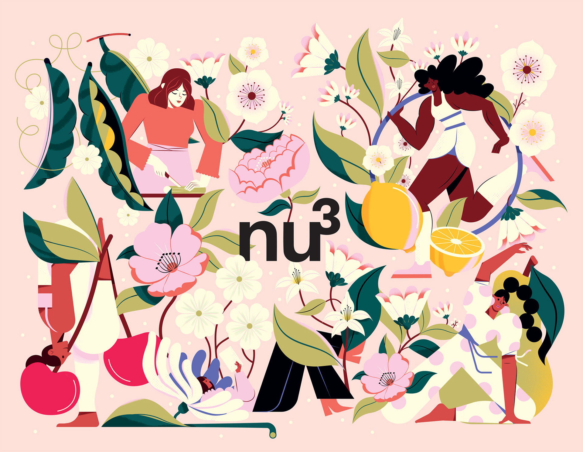
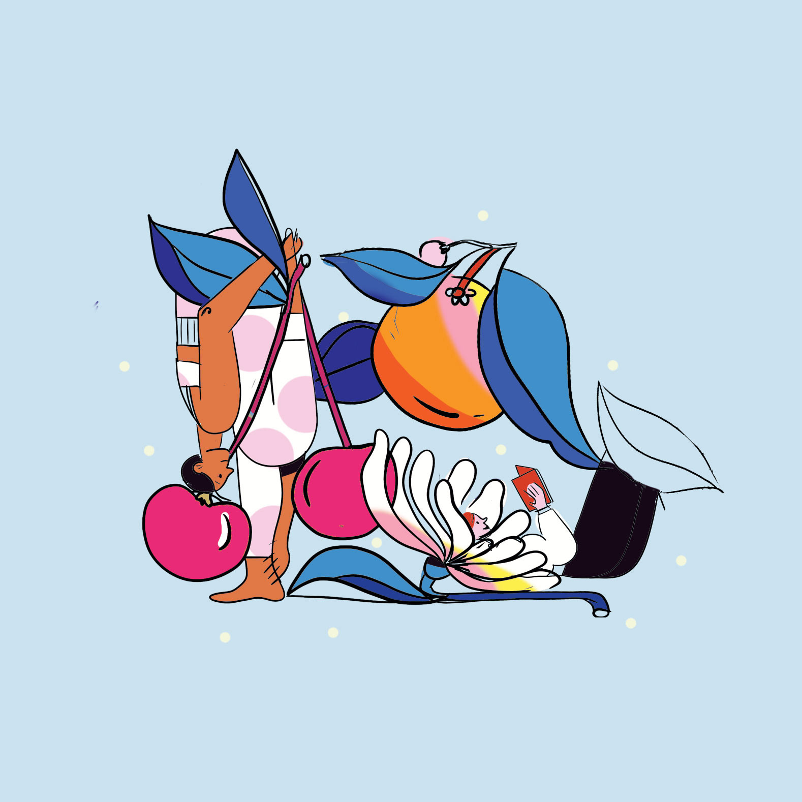
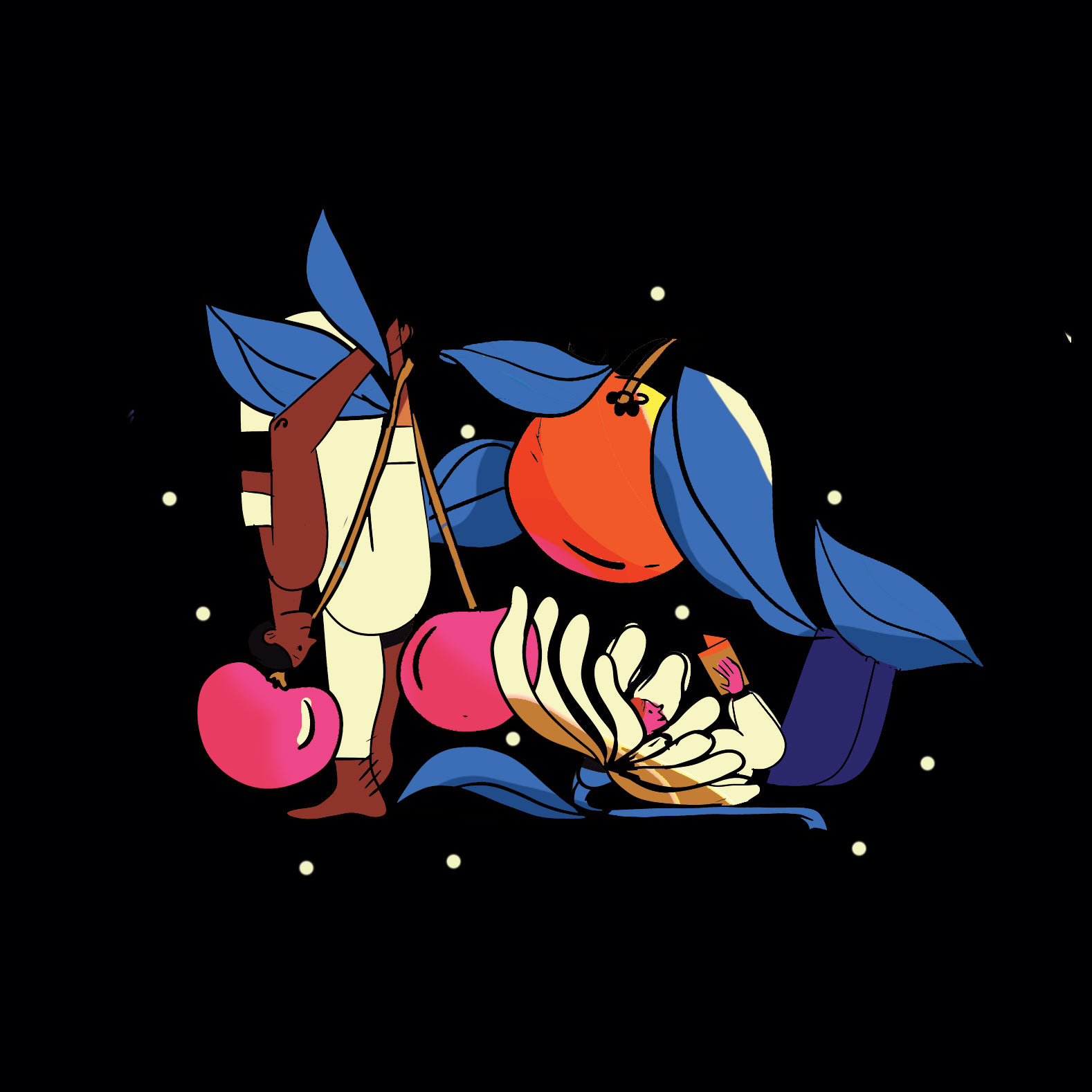
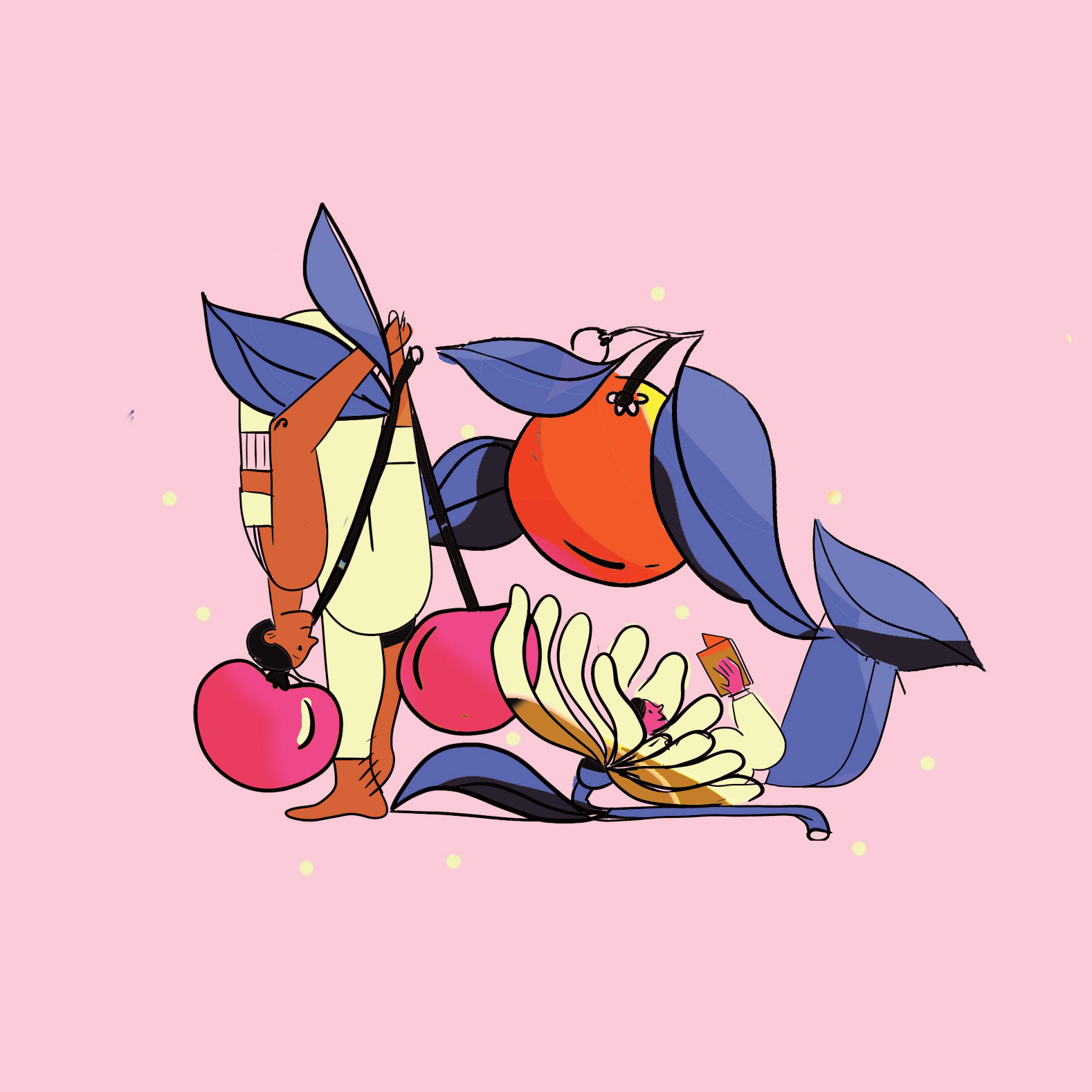
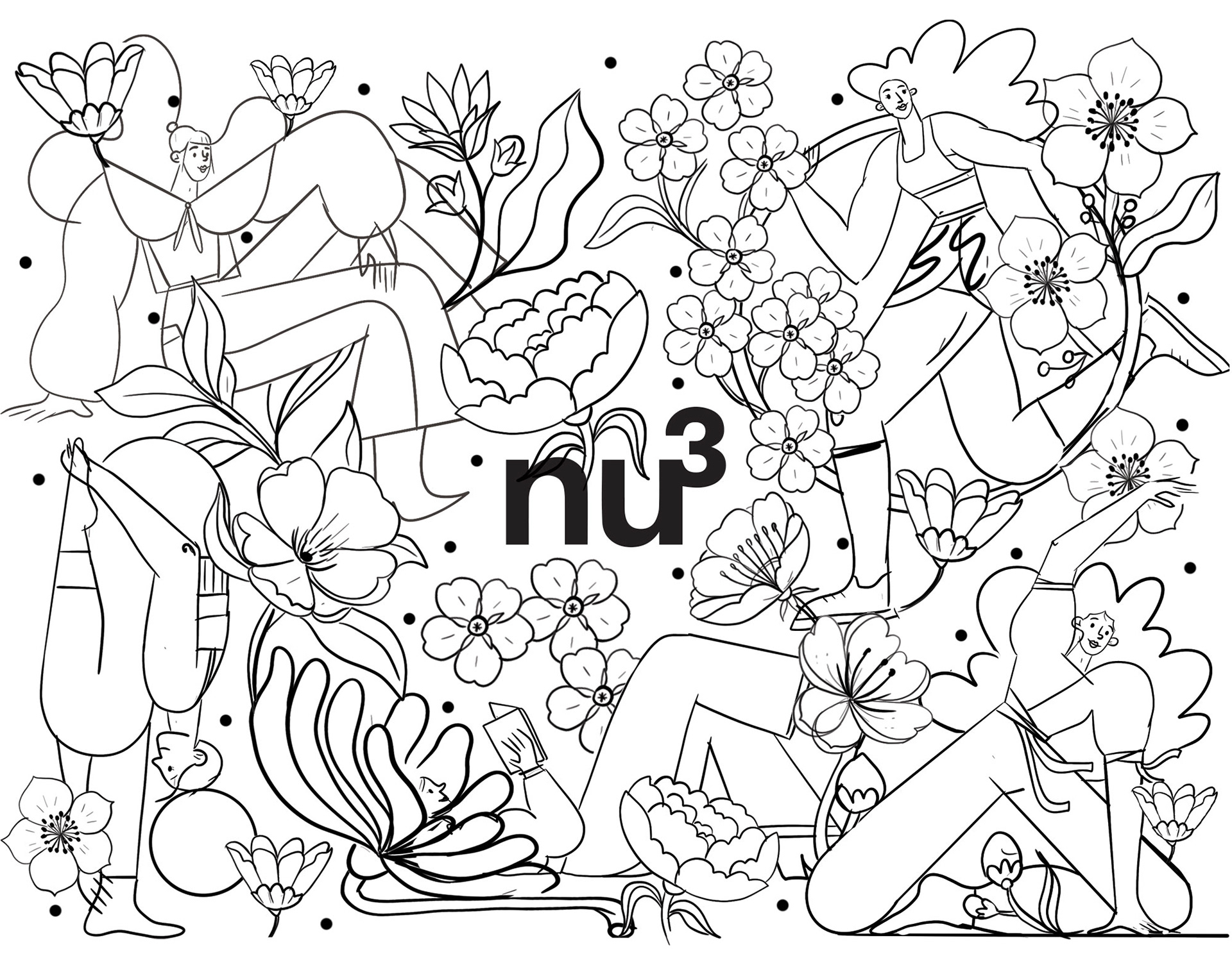
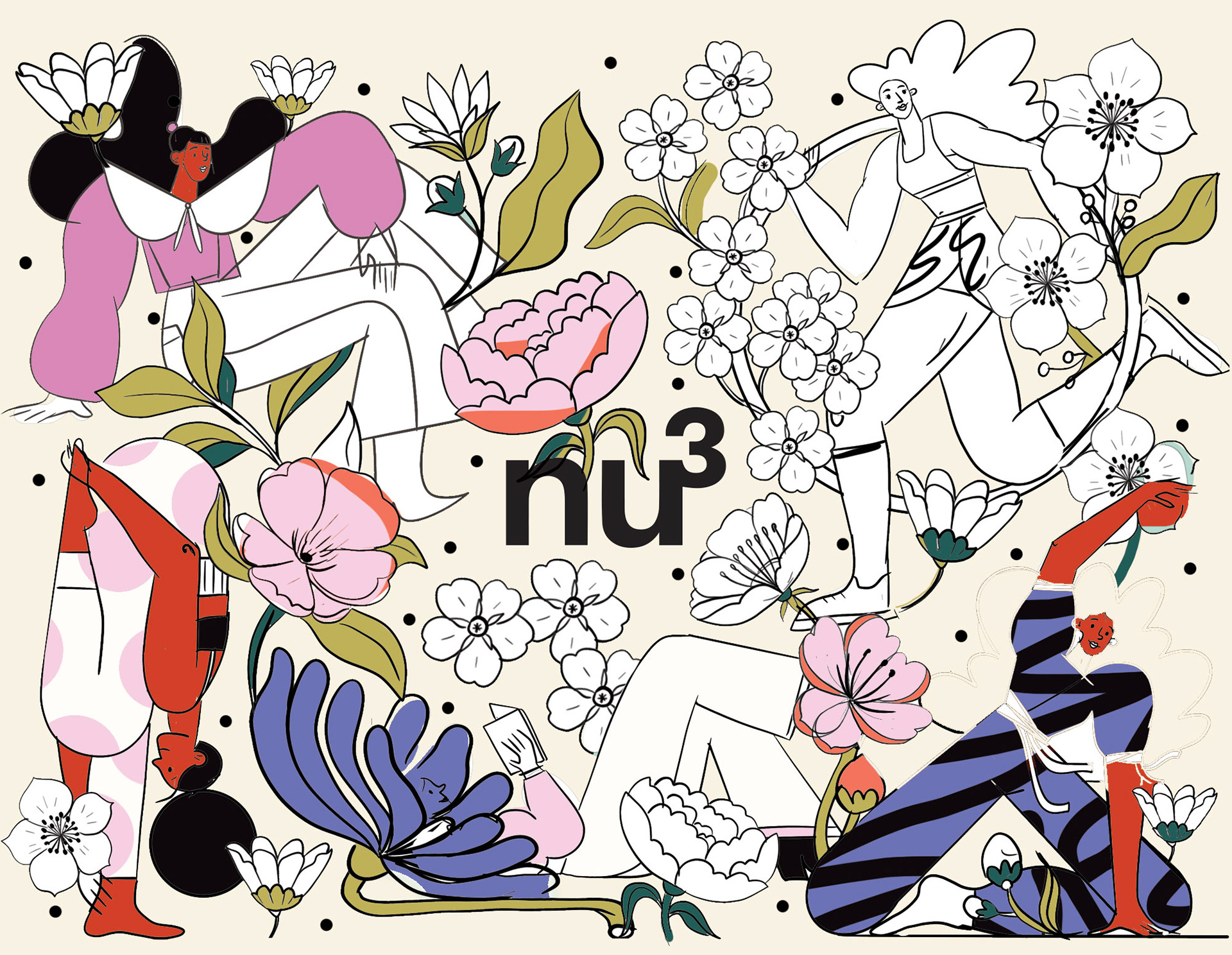
This is a packaging design project for Nu3, a brand specialising in food supplements.
The aim was to design two distinct boxes (one for women, one for men), while ensuring strong visual consistency between the two worlds.
The aim was to design two distinct boxes (one for women, one for men), while ensuring strong visual consistency between the two worlds.
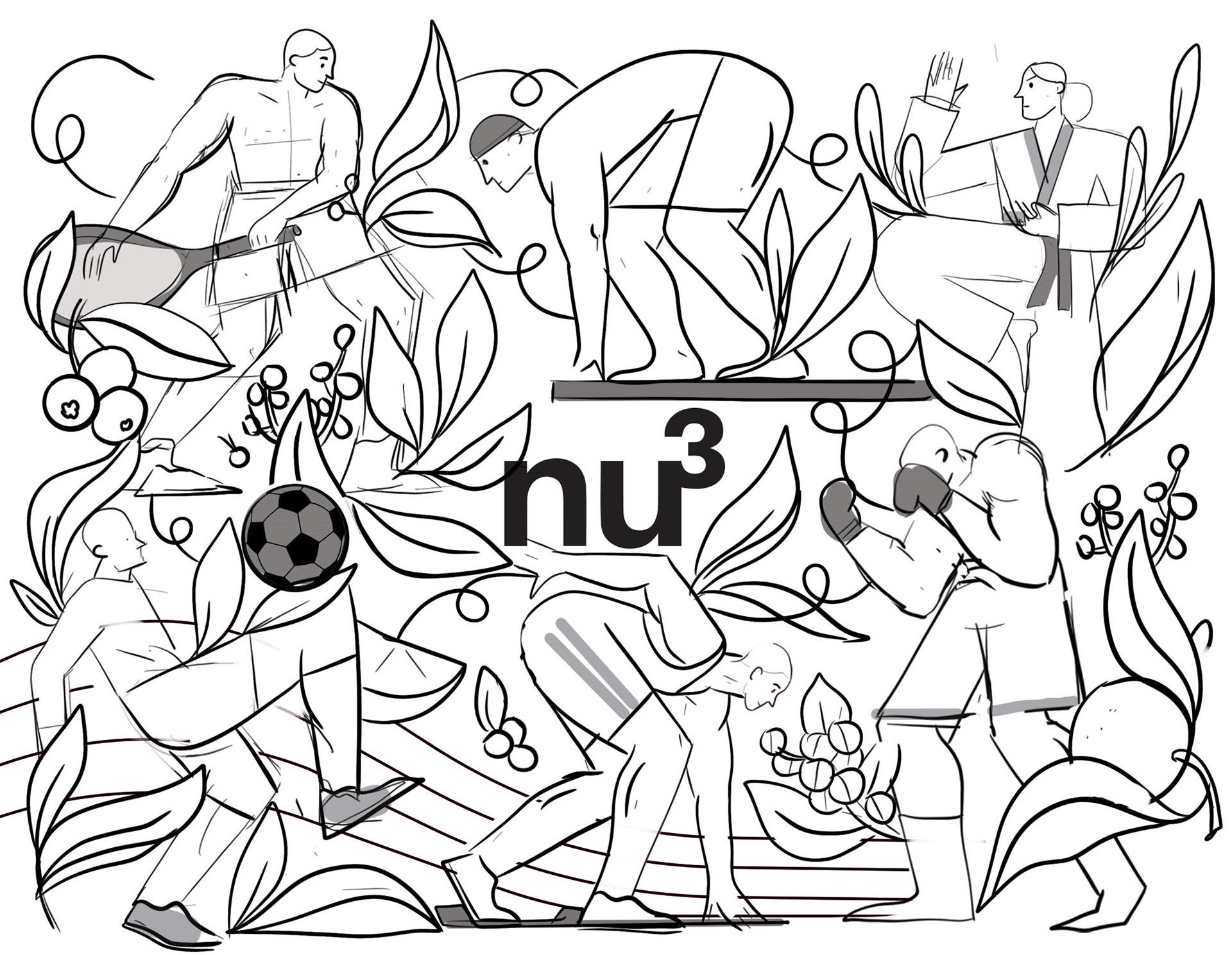
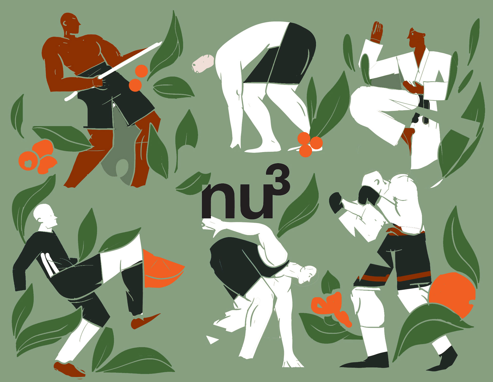
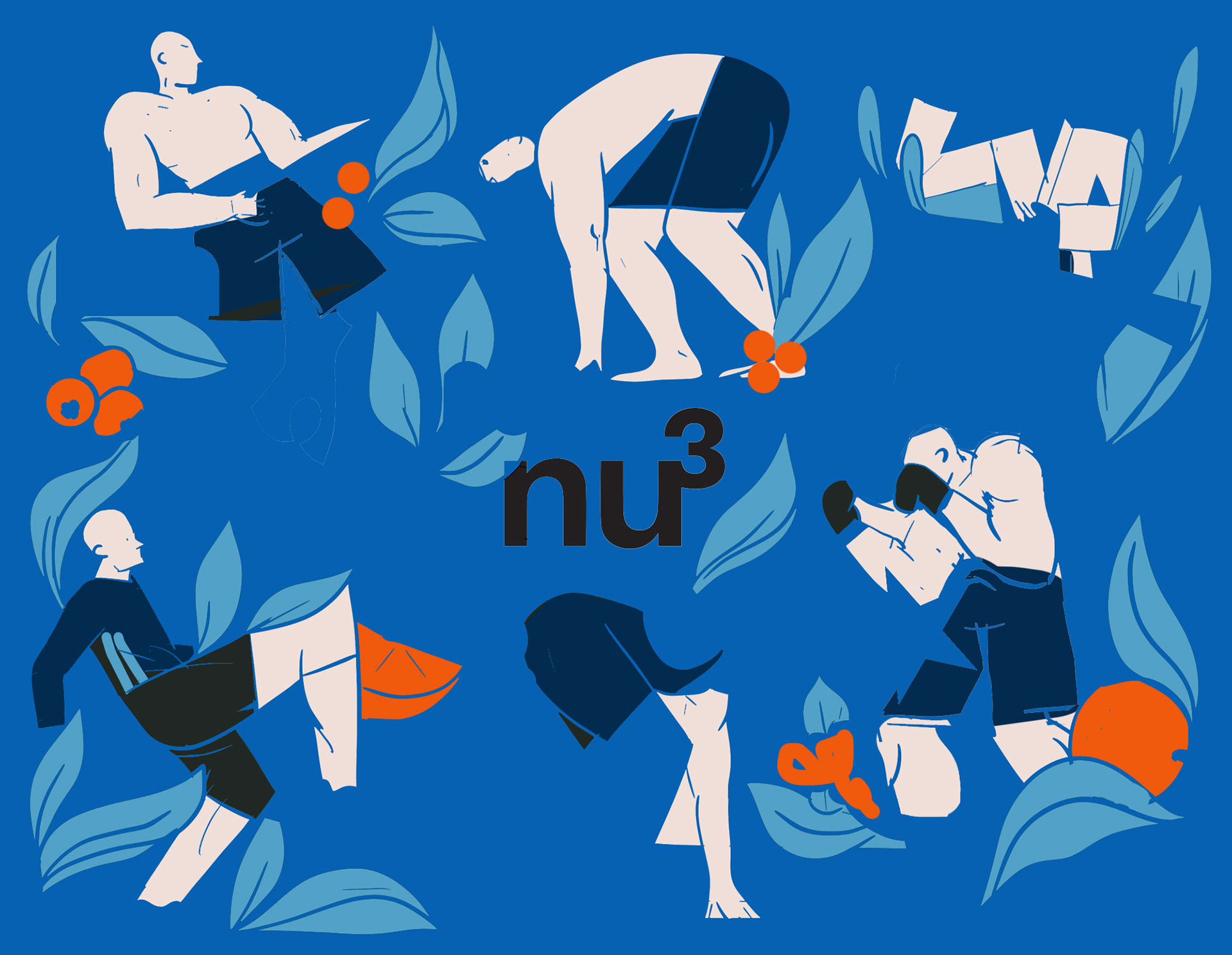
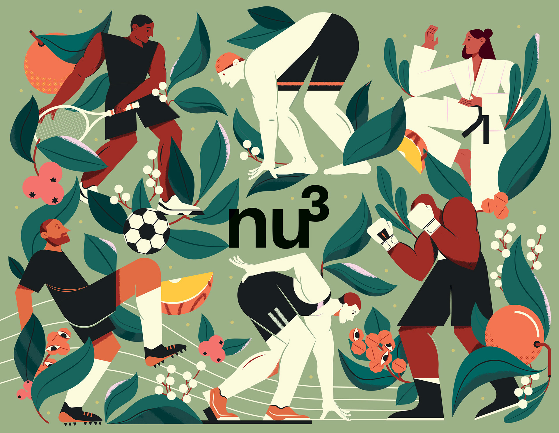
Art Direction
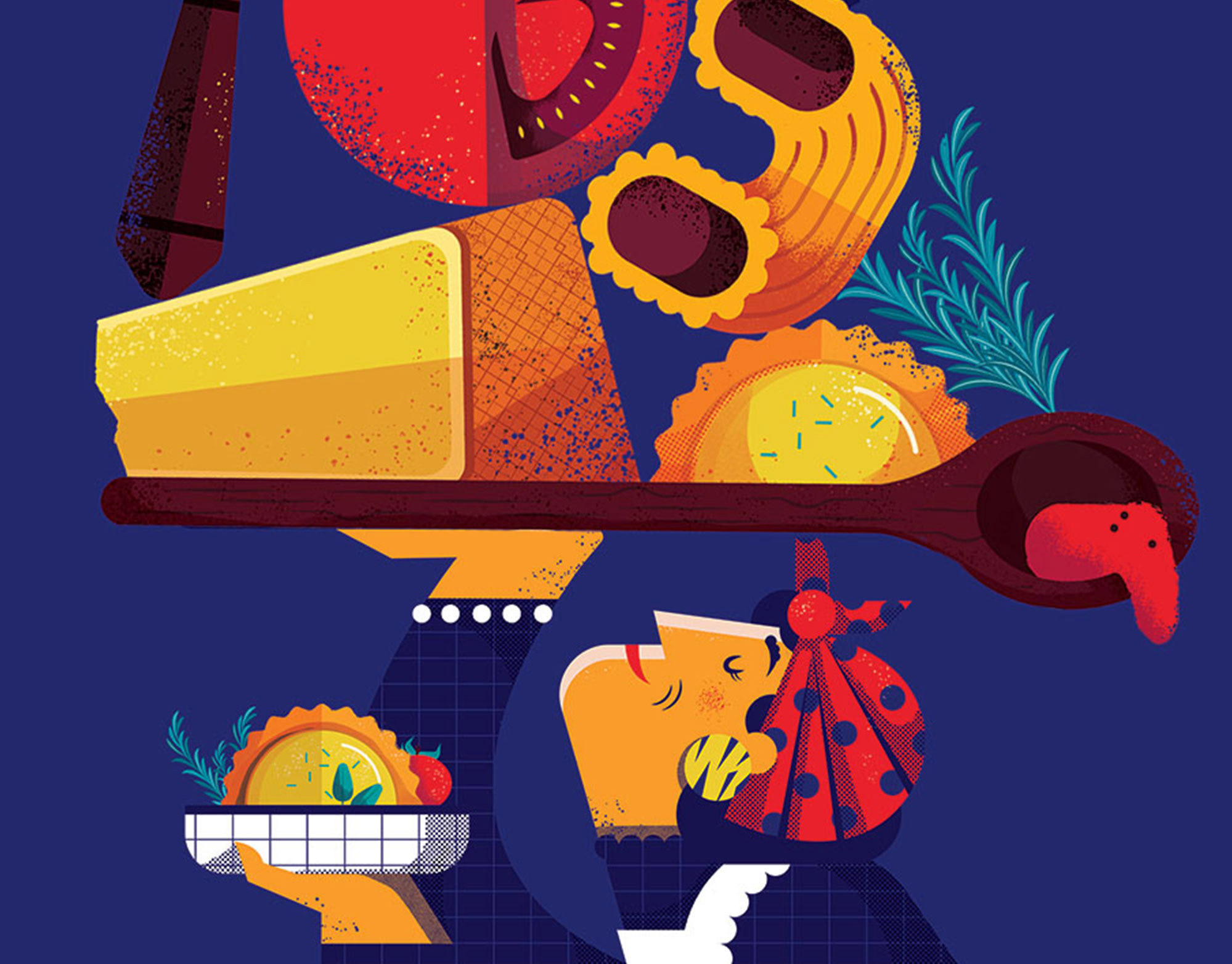
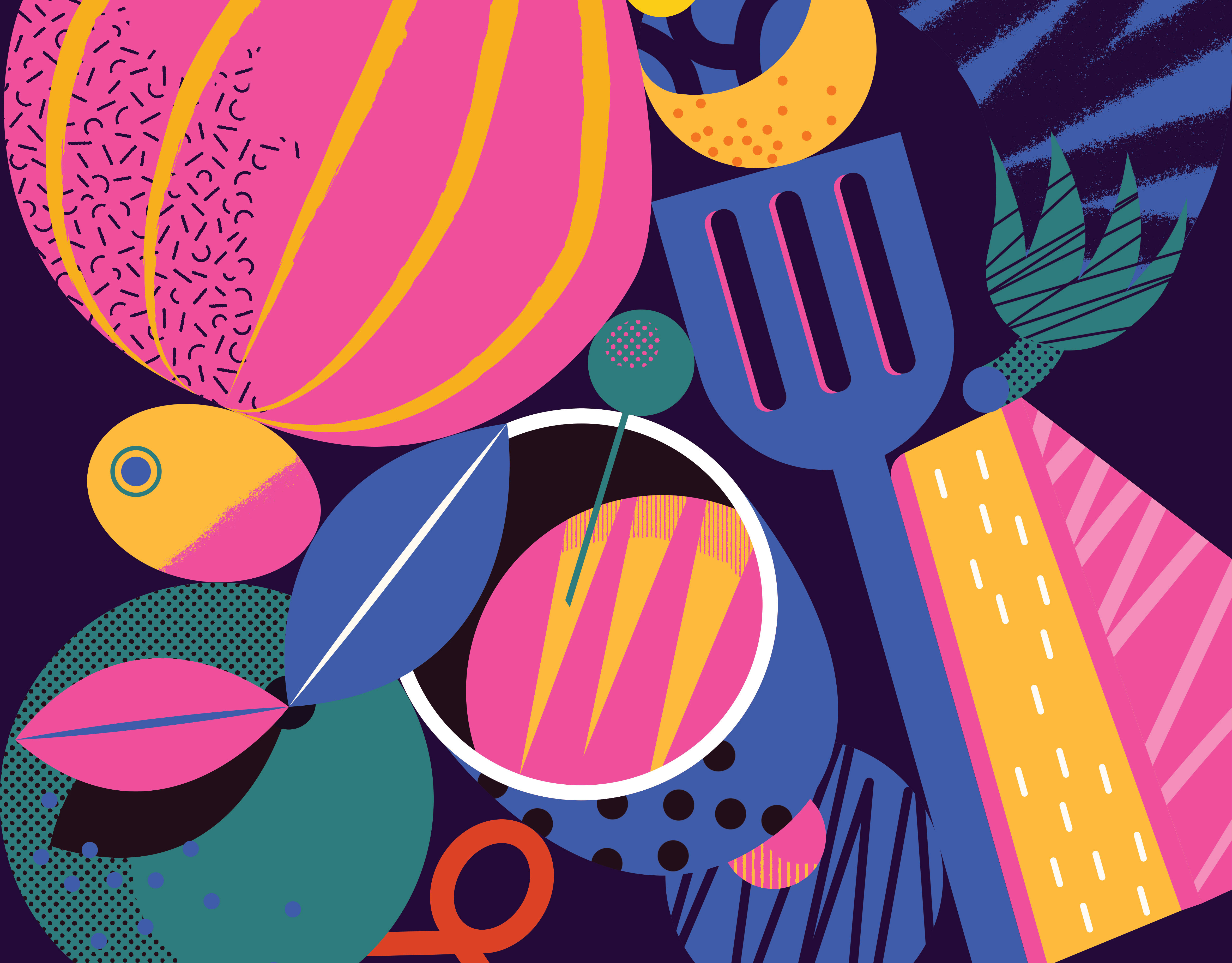
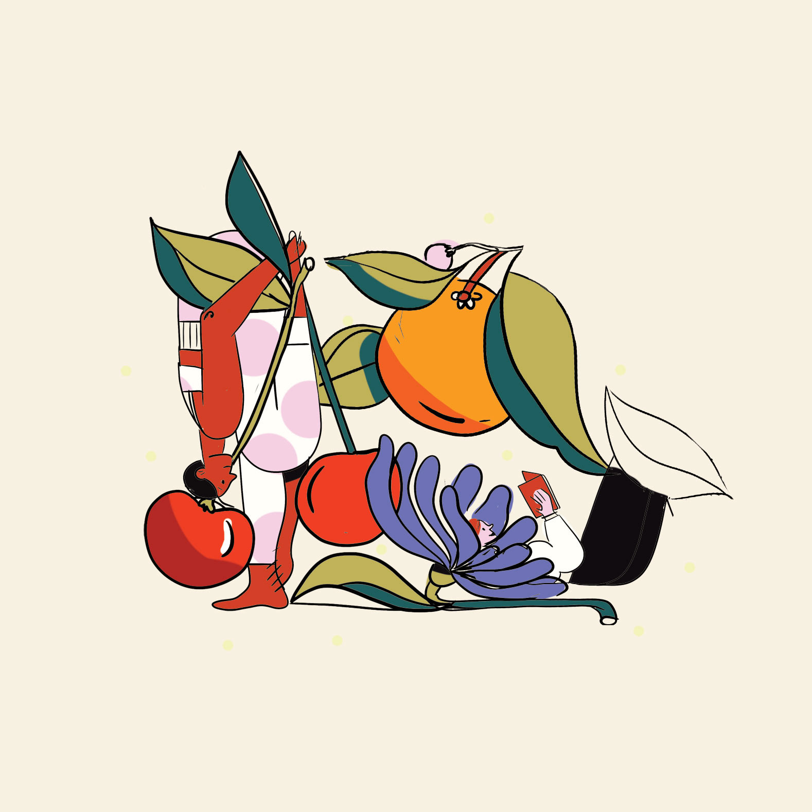
Create a design that reflects the benefits of the products (vitality, balance, well-being), while remaining modern, uncluttered and accessible.
Each box has its own graphic codes to suit its target, but together they form a harmonious visual identity, conceived as a duo.
- A differentiated graphic approach for each target, while maintaining a unified range
- A sober but expressive colour palette
- A clear hierarchy of information
- A design designed to stand out on the shelf or when opening a parcel
- A sober but expressive colour palette
- A clear hierarchy of information
- A design designed to stand out on the shelf or when opening a parcel
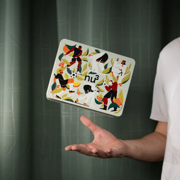
Embossed metal packaging for a unique product experience
Both tins are made from metal, with subtle embossing that adds relief, character and a sense of quality to the touch. Particular attention has been paid to the choice of finishes to enhance the product at first glance.
Both tins are made from metal, with subtle embossing that adds relief, character and a sense of quality to the touch. Particular attention has been paid to the choice of finishes to enhance the product at first glance.


A real team work
Thank you to nu3 for this smooth, caring and inspiring collaboration. Working together on this dual identity was a real pleasure: lots of exchanges, responsiveness, and a real shared desire to create something beautiful and functional !
Thank you to nu3 for this smooth, caring and inspiring collaboration. Working together on this dual identity was a real pleasure: lots of exchanges, responsiveness, and a real shared desire to create something beautiful and functional !